No ordinary adventure among the areetops
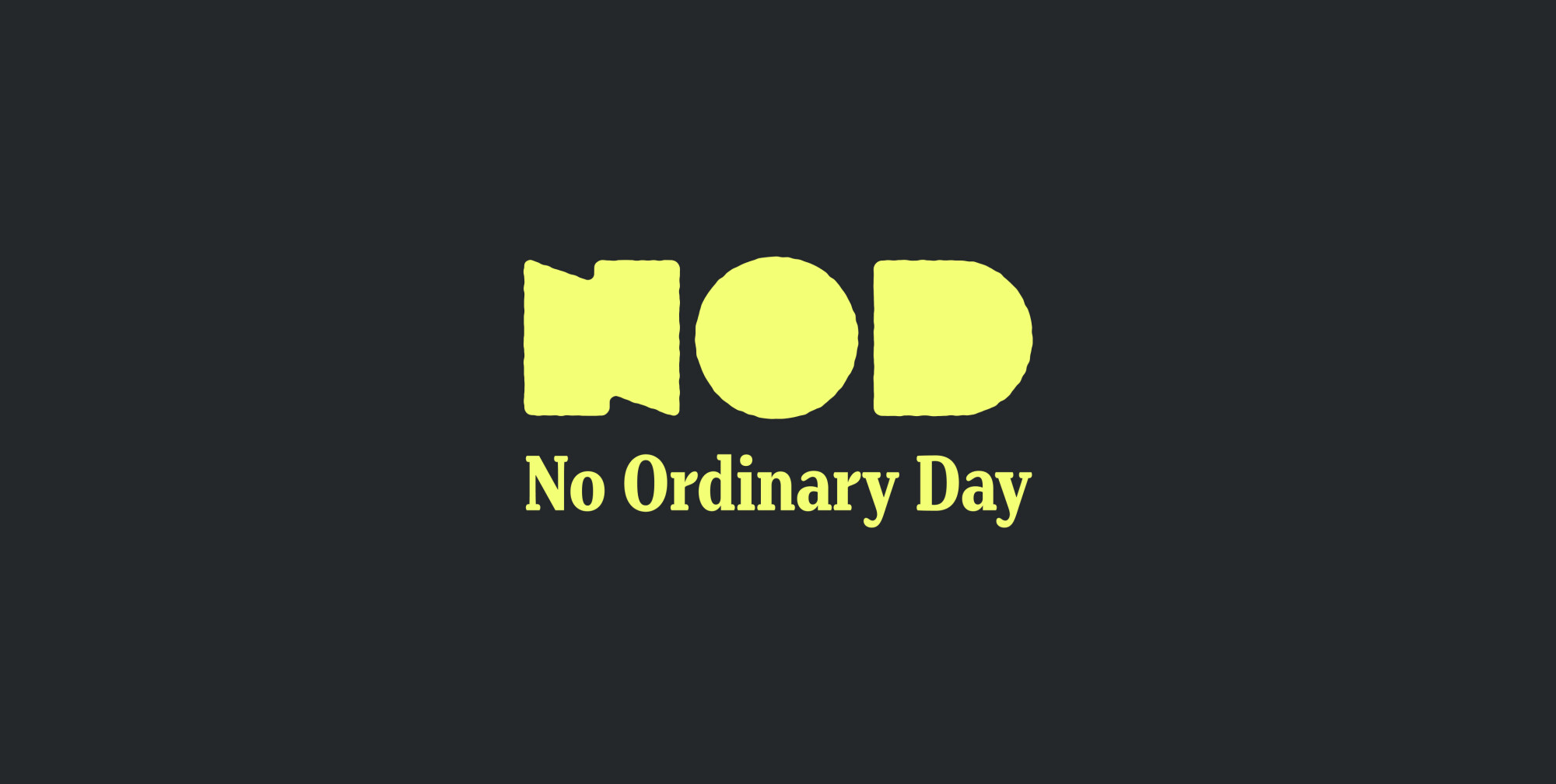
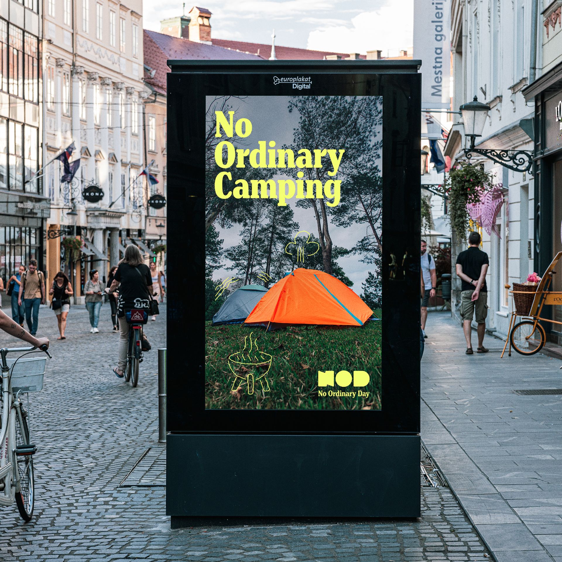
How do you create an identity for Slovenia’s largest adventure park that is as bold and unconventional as the experiences among the treetops? By thinking differently. We developed the brand’s creative story, named it NOD, and created a visual identity built around striking contrast, a playful character, and clear messaging. A black-and-yellow colour palette, dynamic typography, playful illustrations, and a relaxed tone of voice come together to create a brand that captures visitors’ attention before they even take on their first challenge.
Client
NOD
Services
Brand creation
Websites
Categories
Tourism
A story that invites you to take action
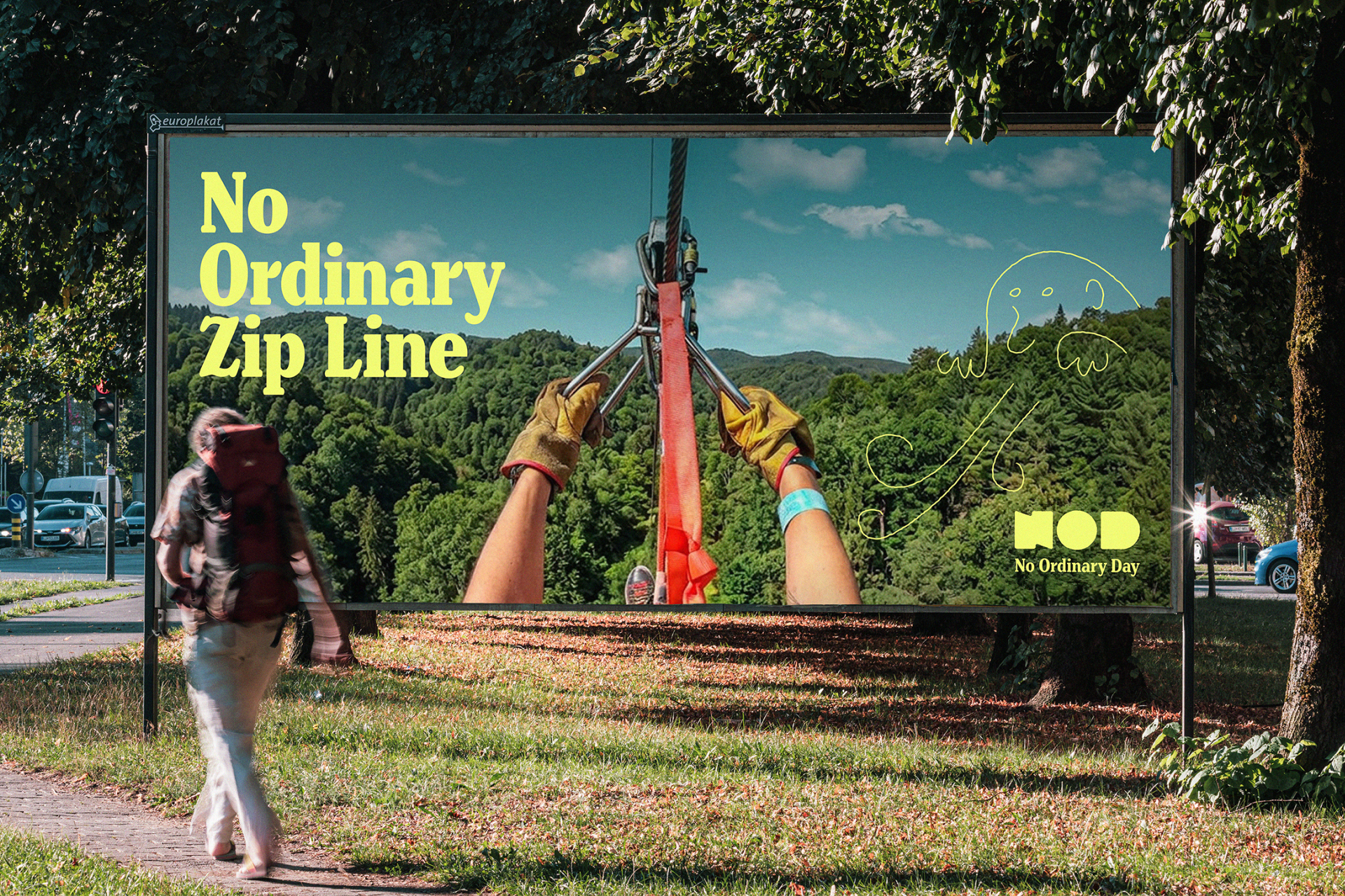
At the heart of the communication is the idea of experiences that come together to create a day spent in nature. A day that is fun, social, unforgettable, and, above all, anything but ordinary. This idea became an integral part of the brand’s messaging and its positioning slogan: NOD (No Ordinary Day). The slogan can easily be adapted modularly to suit different applications (e.g. No Ordinary Place, No Ordinary Fun, No Ordinary Cycling). With a clear, energetic call to action and a playful tone of voice, the brand speaks to both families and adrenaline seekers. Because at NOD Park, everyone can find something that’s just right for them.
A design you can’t miss
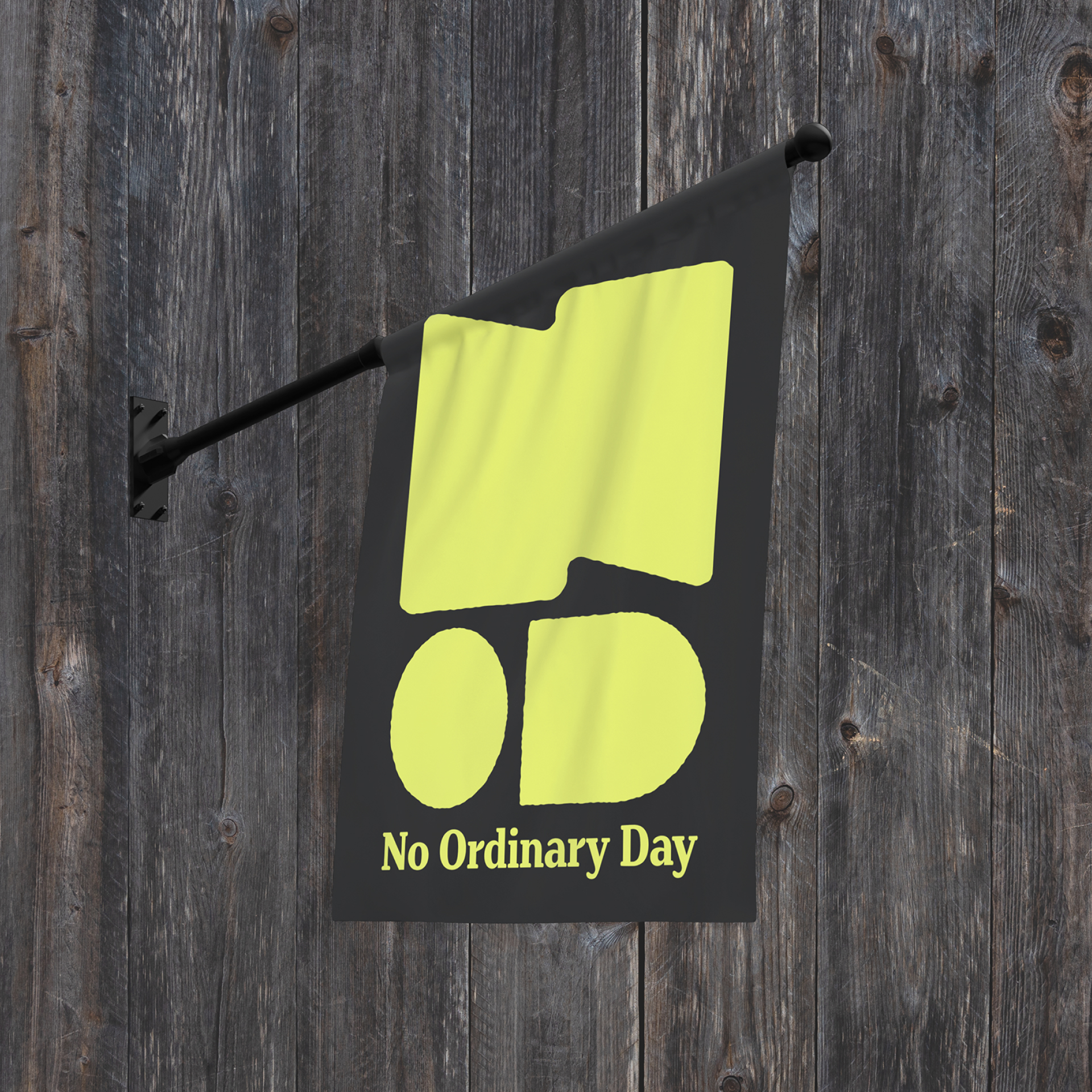
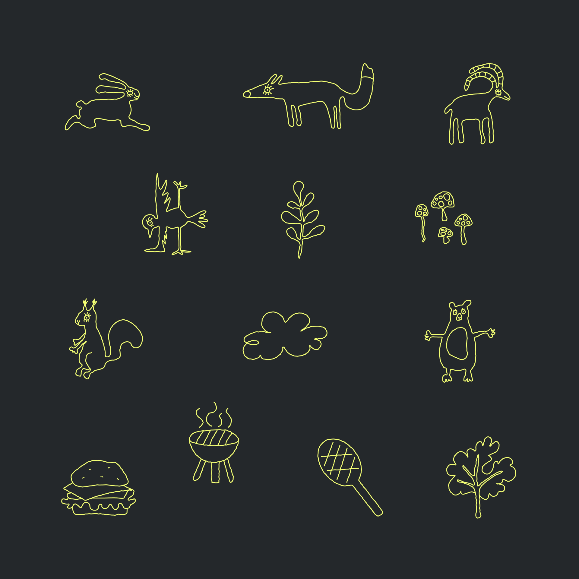
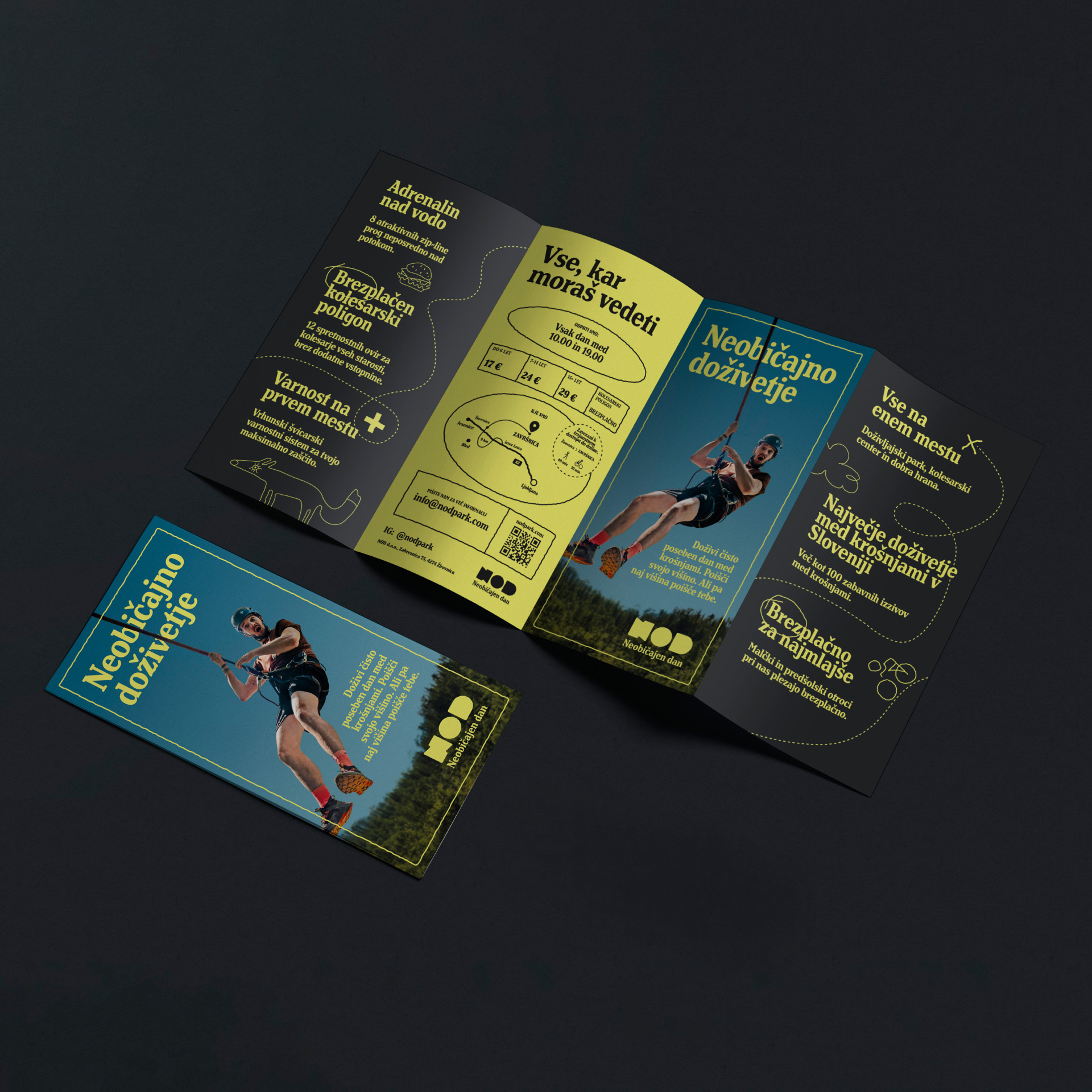
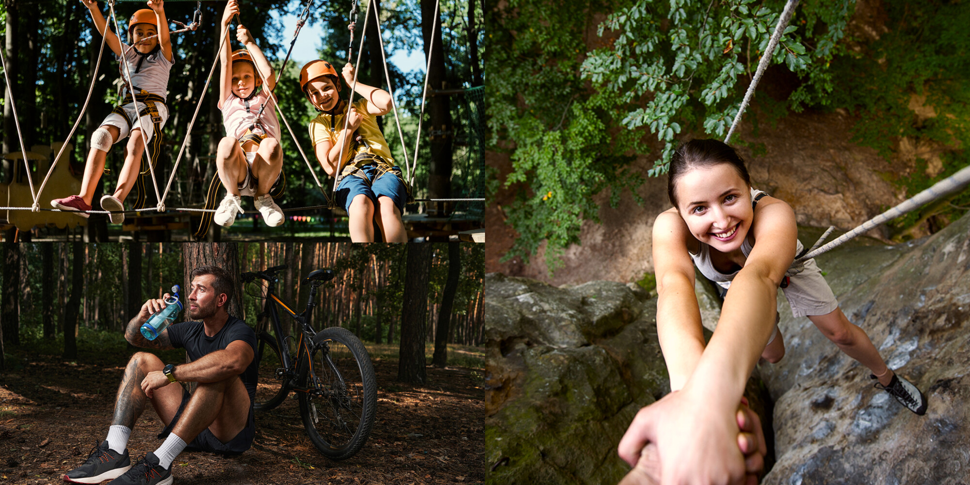
The foundation of the brand’s visual identity is a modular logo built around the NOD acronym. Its organic, robust, and free-flowing form expresses the power of nature. The primary typeface, Henriette Compressed Heavy, is a compact serif font whose distinctive weight and retro character give the brand a sense of stability and recognition. The visual communication is defined by the contrast between a deep, almost-black background and an energetic neon yellow — creating a strong visual impact while ensuring excellent message legibility. Relaxed line illustrations complete the concept, appearing alongside photographs that capture authentic moments of action, fun, and relaxation.
»NOD is a bold, dynamic, experience-driven brand that invites people to actively explore the world beyond the boundaries of everyday life. The interplay of adrenaline-fuelled experiences, nature, and unforgettable moments is clearly reflected in its visual identity, built around bold contrasts and playful illustrations. Above all, it celebrates freedom, playfulness, and the extraordinary.”
A website as the beginning of an adventure
We designed the website as a fast, intuitive, and visually engaging information hub. Alongside planning, development, and content creation, we paid particular attention to ensuring that the brand’s digital presence conveyed the same energy as the park itself. We achieved this through strong visual accents, evocative photography, playful copy, and clear information about the offering, prices, location, and opening hours — enabling visitors to plan their day in advance.
“Innovatif brought a fresh, youthful energy to our project through the brand proposal and playful illustrations. It was a difficult decision at first, but now it’s hard to imagine having made any other choice. We’re thrilled with the final look of our brand and the website, both of which perfectly reflect what NOD Park is all about — something different, bold, and above all, fun.”
From the first encounter to the final peak
We developed the brand’s personality and visual language with care, ensuring they work equally well in the digital environment, where visitors first encounter the brand, and in the physical space of the adventure park, which stretches across both banks of the Završnica stream. We designed information boards and promotional materials that intuitively guide visitors through the park while maintaining a recognisable brand style. We also created a unified clothing range for the park team, making them instantly recognisable whenever visitors need assistance. Every element of communication contributes to the feeling that NOD Park is one connected story.
A strong identity in a limited time
The project was completed within a very tight timeframe, as its delivery was tied to the park’s opening. This made it essential to organise the work into phases based on priorities. Close collaboration with the client was equally important, enabling quick decision-making and a consistent approach to the brand as a whole. Above all, it required thinking beyond established conventions. The result is not just a bold new visual identity, but a recognisable communication system that works equally well online, in promotional materials, and throughout the park.
Fresh projects are on the way! Sign up for news!
Related projects
Postojnska jama
An Exhibition about Olms
Ljubljanski grad
Meet Friderik from the Ljubljana castle