Hostel Celica with a refreshed identity
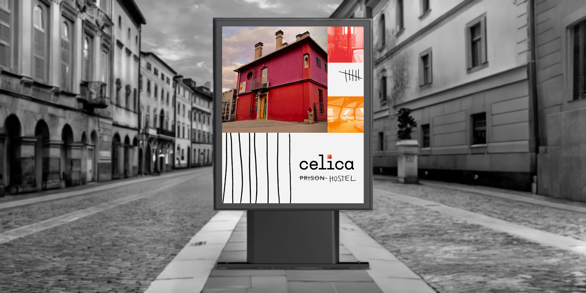
Hostel Celica on Metelkova Street in Ljubljana is an iconic building with a unique story. The former prison welcomed its first guests in 2003 as a modern hostel with an artistic soul. In 2026, we carried out a complete website redesign and visual identity refresh, with today’s travellers and digital nomads in mind – people who look for more than just a place to stay when choosing their accommodation.
Client
Javni zavod Ljubljanski grad / Hostel Celica
Services
Websites
Categories
Public sector
Tourism
Website
A night behind bars?
Hostel Celica is far from your typical hostel with bunk beds – it is one of Ljubljana’s most distinctive places to stay. Here, guests sleep behind the bars of former prison cells, transformed by artists from around the world. Its remarkable story – turning a former prison into a place of creativity, culture and hospitality – makes it one of the most unique places to stay in the region. This distinctive character also became the starting point for a complete refresh of the brand’s visual identity.
A refreshed identity for a new generation of guests
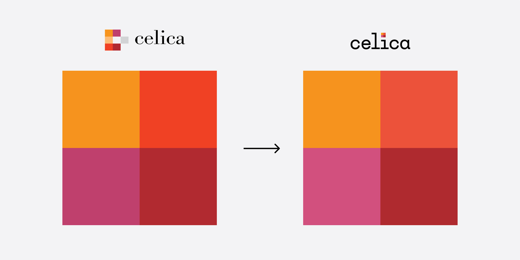
The goal of the visual identity refresh was to create a more contemporary and consistent look while retaining the brand’s distinctive character and making it more relevant to today’s guests. The new visual identity highlights the contrast between the building’s unusual history and its modern, creative spirit. With refreshed typography, a simplified colour palette and new graphic elements, we created an engaging and distinctive visual system that works effectively across the website and other communication channels.
“Working with Innovatif was professional and seamless throughout every stage of the project, with quick responses and clear, friendly communication we could always rely on. Their ideas were fresh and innovative, showing a genuine understanding of Celica as a brand and translating it into a modern, distinctive approach to communication. We are proud of the result, which presents Celica exactly as we want our guests to see it.”
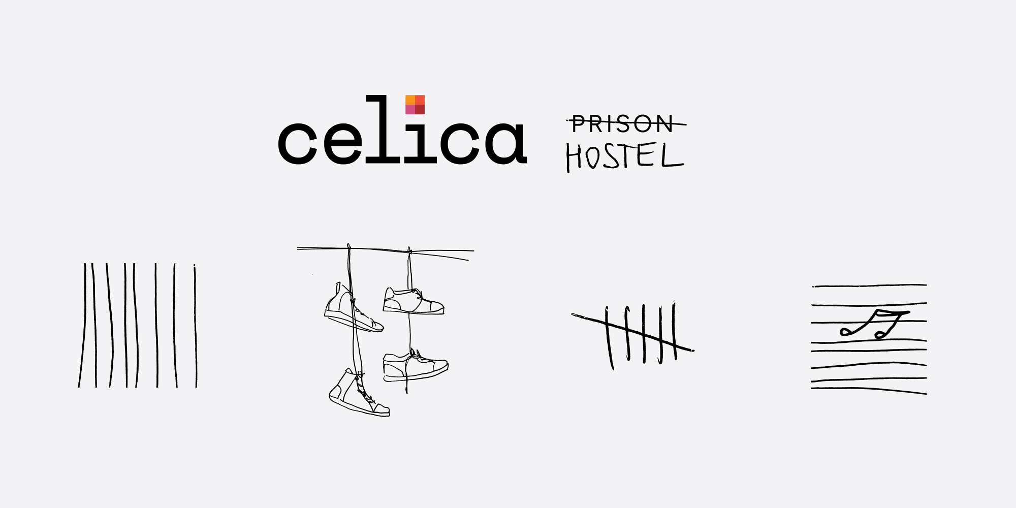
A logo that literally puts the dot on the i
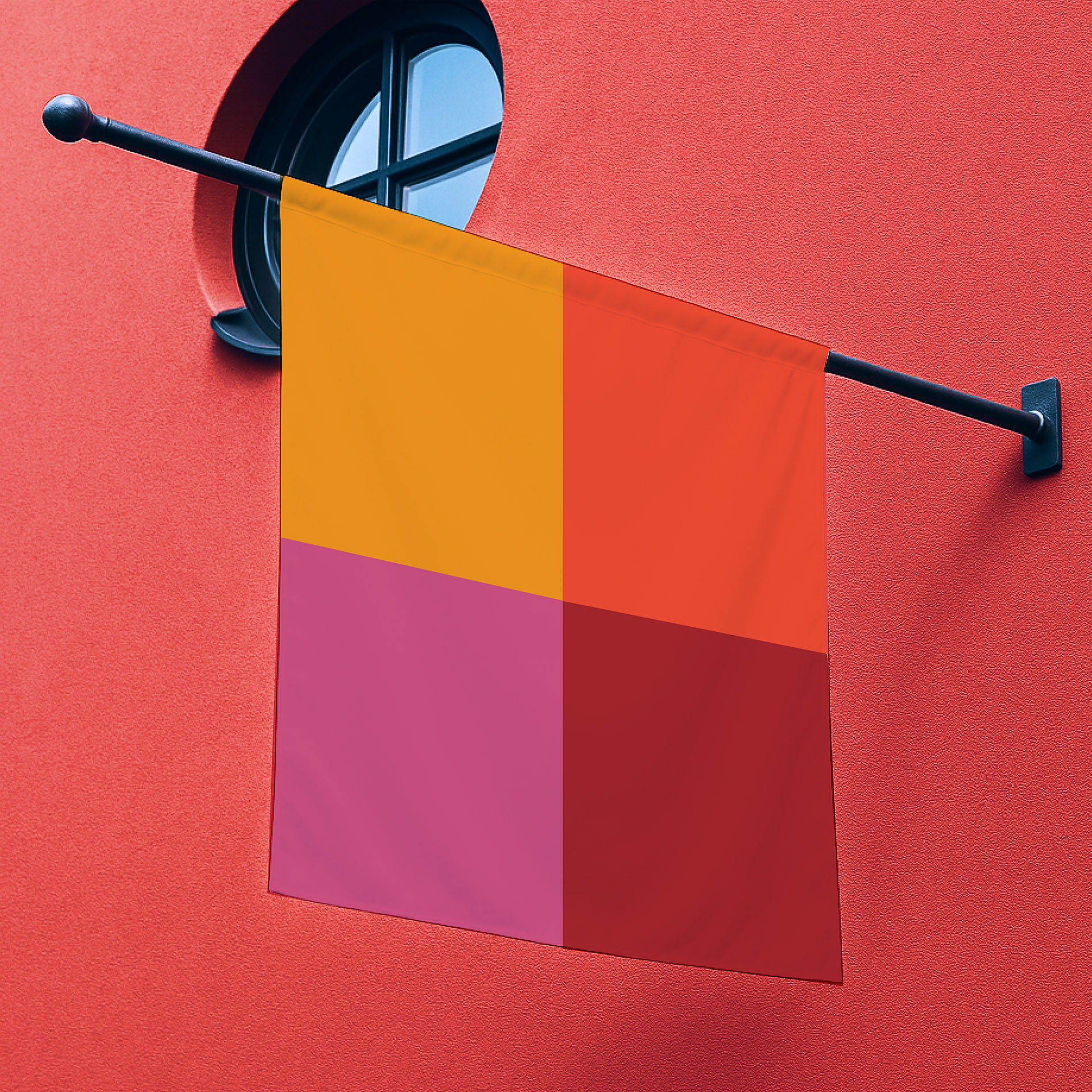
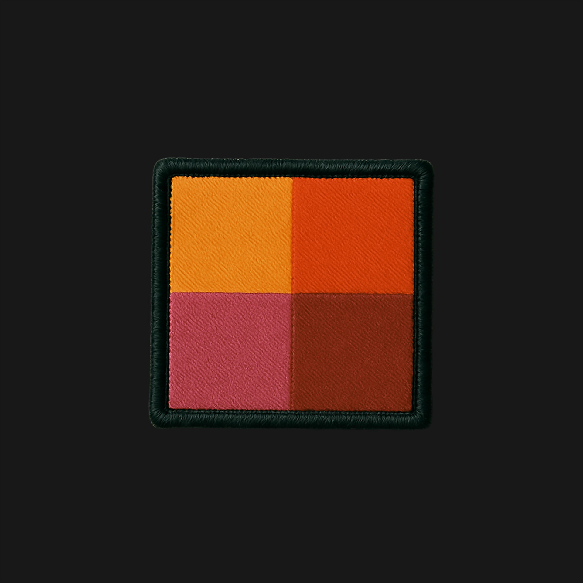
The logo builds on the existing design, taking its four core colours and bringing them together in a square symbol that represents a cell. The symbol becomes a distinctive visual element that can also stand on its own, while its individual components form the basis of the wider visual identity.
New hand-drawn elements create a contrast with the square blocks of colour and add a playful touch to the identity. Photography blends with the coloured squares through either colour filters or the colours within the images themselves. The system allows for a variety of compositions while keeping the overall look dynamic. To balance the complexity of the visual system, we chose a simple, single-weight typeface with a strong, distinctive character.
A website that sparks curiosity
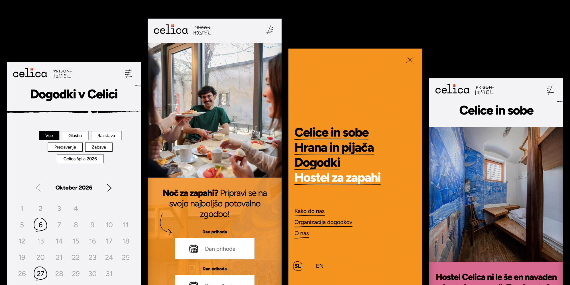
Following the first redesign we carried out in 2019, the existing website was ready for a more comprehensive overhaul to deliver an optimal user experience. The project included a new content structure, a complete design refresh, new functionalities and an upgrade to a more advanced version of the SilverStripe content management system.
The result is a modern digital platform that brings together Hostel Celica’s history, culture and hospitality, giving visitors a sense of the distinctive character the hostel is known for from their very first interaction.
Na poti so sveži projekti.
Prijavi se na novice.
Related projects

Ford Slovenija
Going further with Ford Slovenia

Turizem Ljubljana
Visit Ljubljana, a lively and vibrant capital