Heksagon – Corporate Visual Identity and Website Redesign
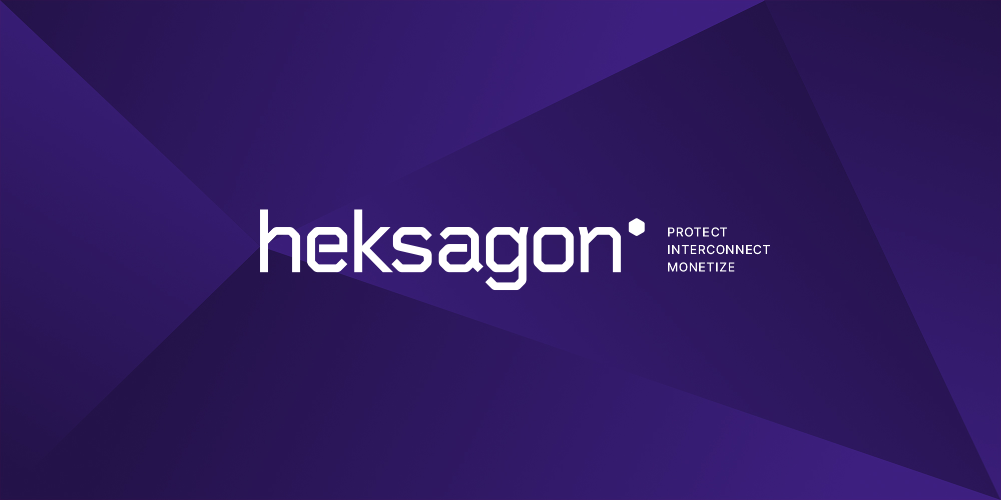
For Heksagon, a company that provides advanced global solutions for fraud prevention, interconnection, and service monetization for telecommunications operators, we carried out a comprehensive redesign of its visual and digital presence. The project included restructuring the product portfolio, renewing the corporate visual identity, and the design and development of the website.
Client
Heksagon d.o.o.
Services
Graphic and web design
Websites
Categories
B2B
Stability, Connectivity, and Innovation
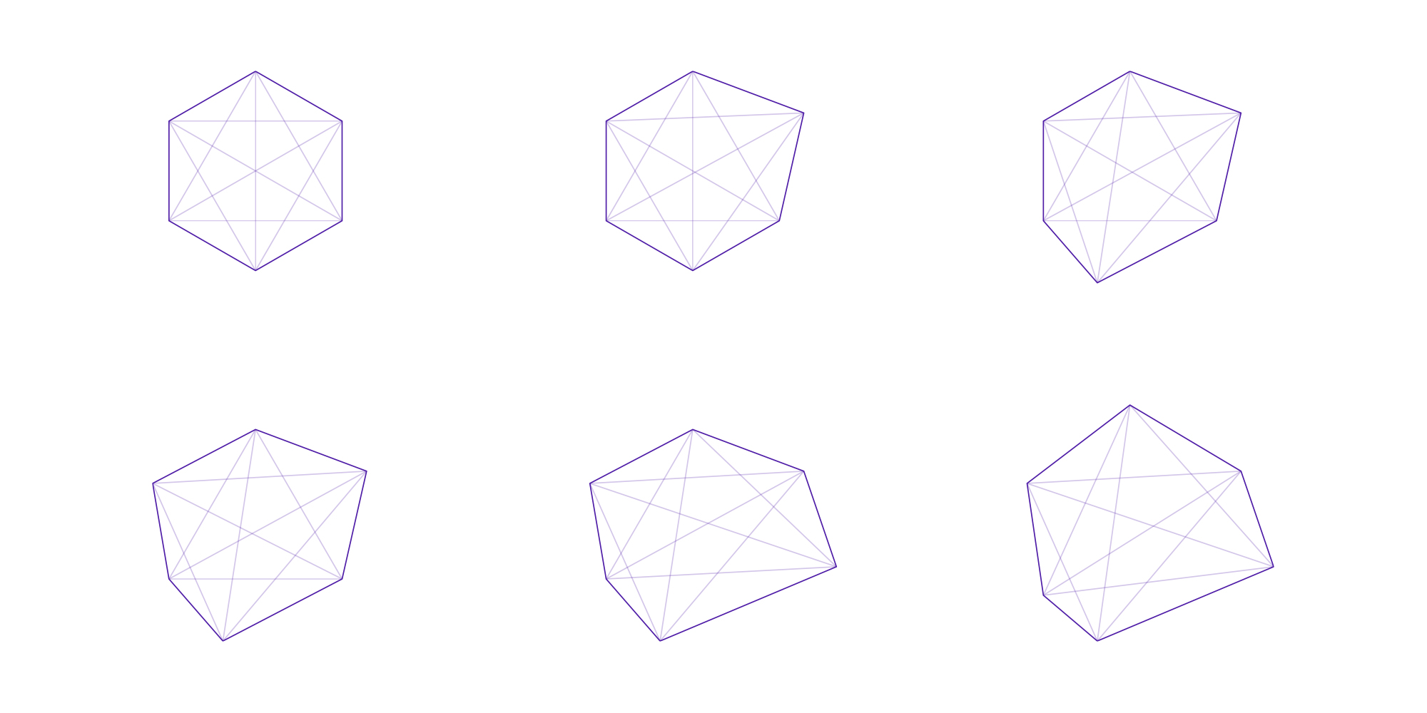
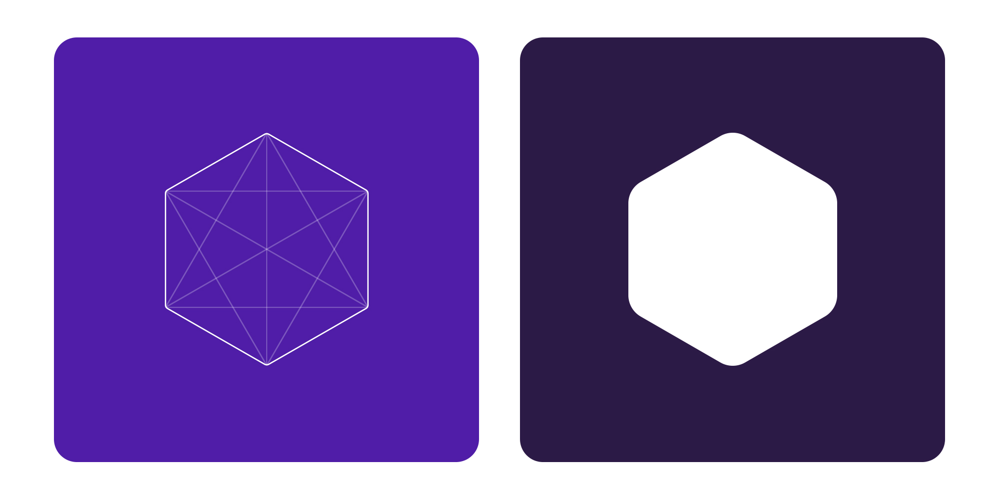
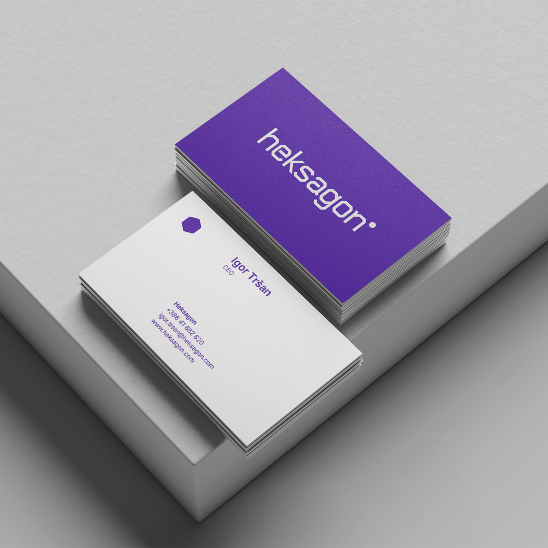
The central element of the visual identity redesign is the hexagon—a geometric shape reimagined into a modern and distinctive visual language that reflects the company’s technology-driven focus. The hexagon is not merely a graphic element, but a symbol of stability, connectivity, and digital innovation, clearly differentiating the company from its competitors while enabling flexible adaptation and application across a wide range of communication materials.
A Distinctive Yet Recognizable Character
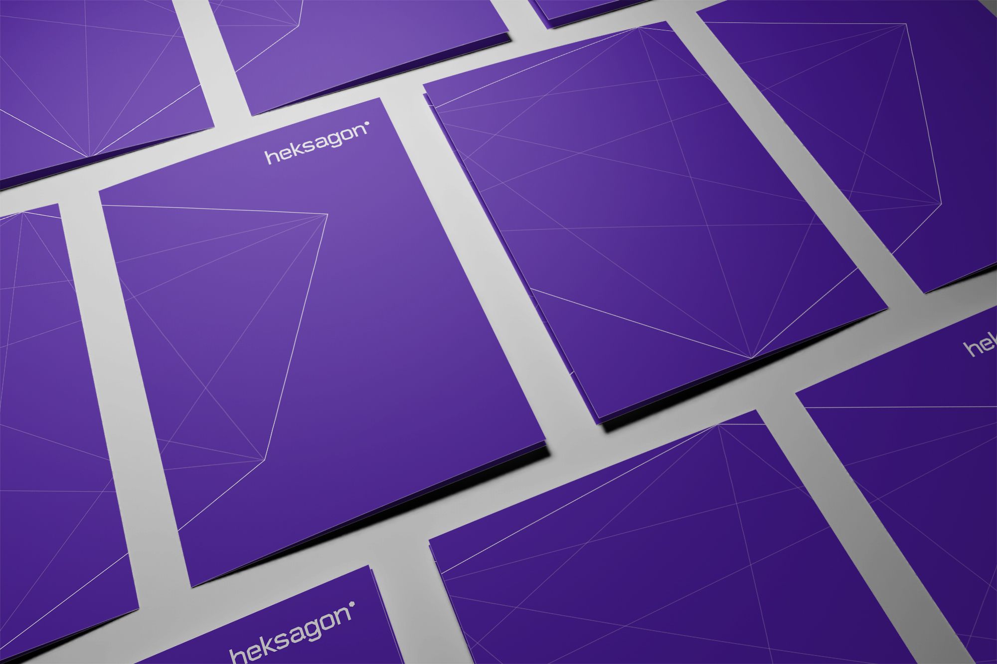
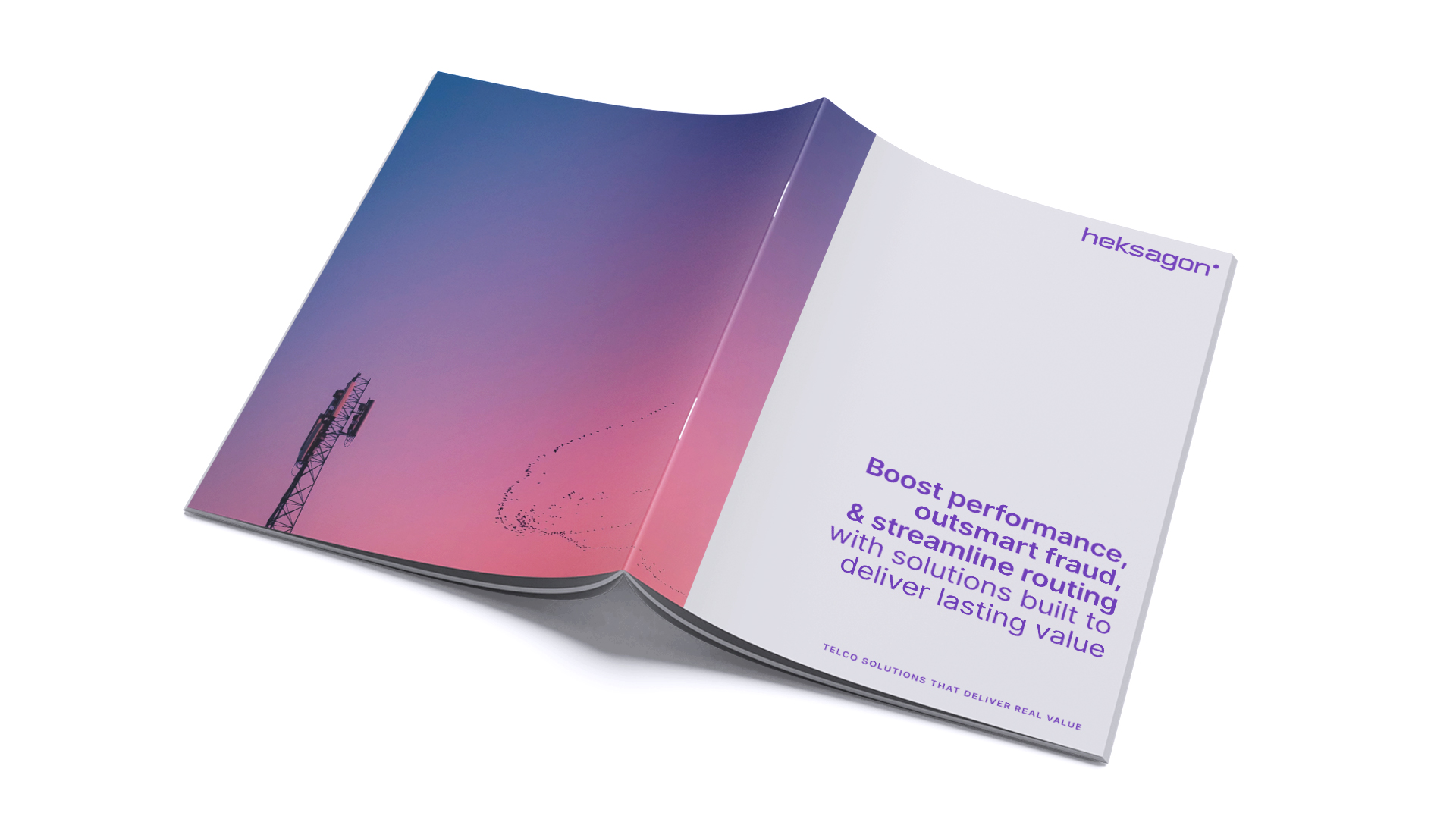
We developed a fresh color palette that stands out in the market with a bold purple tone, along with typography that combines professionalism and readability with a modern, digital character. Every element—from the logo to business cards, letterheads, and digital signatures—is distinctive, consistent, and ready for use across all channels, both digital and traditional. The thoughtfully designed visual identity is built to remain fresh and relevant for years to come.
The Website as an Effective Digital Tool
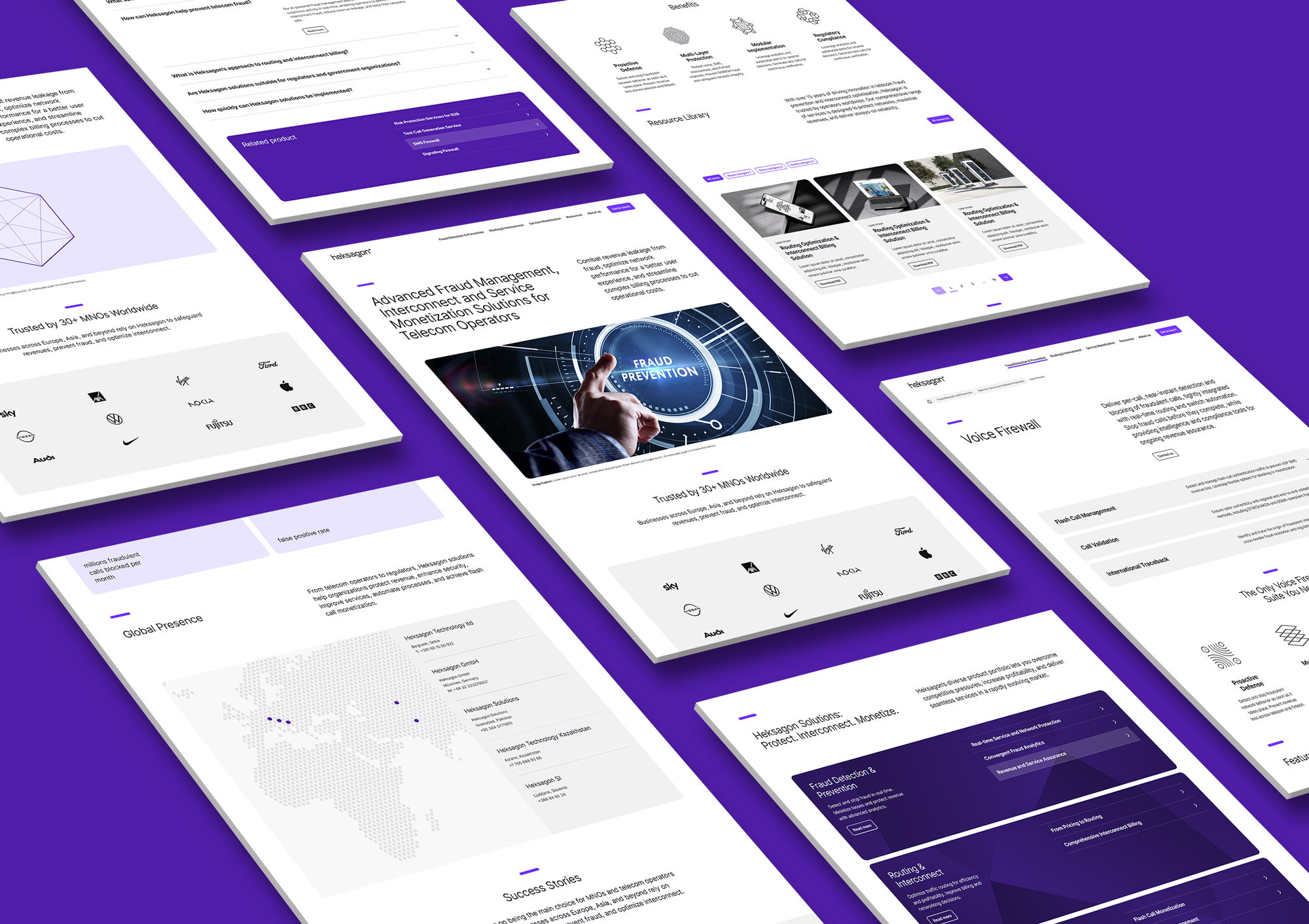
The website redesign is based on an in-depth analysis of the needs of B2B users, the market, and the company’s portfolio. The new platform is conceived as an interactive experience, where animations, smooth transitions, and subtle visual effects guide visitors through an intuitive exploration of products and services. Information is clearly structured and presented using modern typography and a color palette that supports the brand’s renewed narrative. As a result, the website has become a dynamic and effective digital tool, optimized for seamless display across all devices.
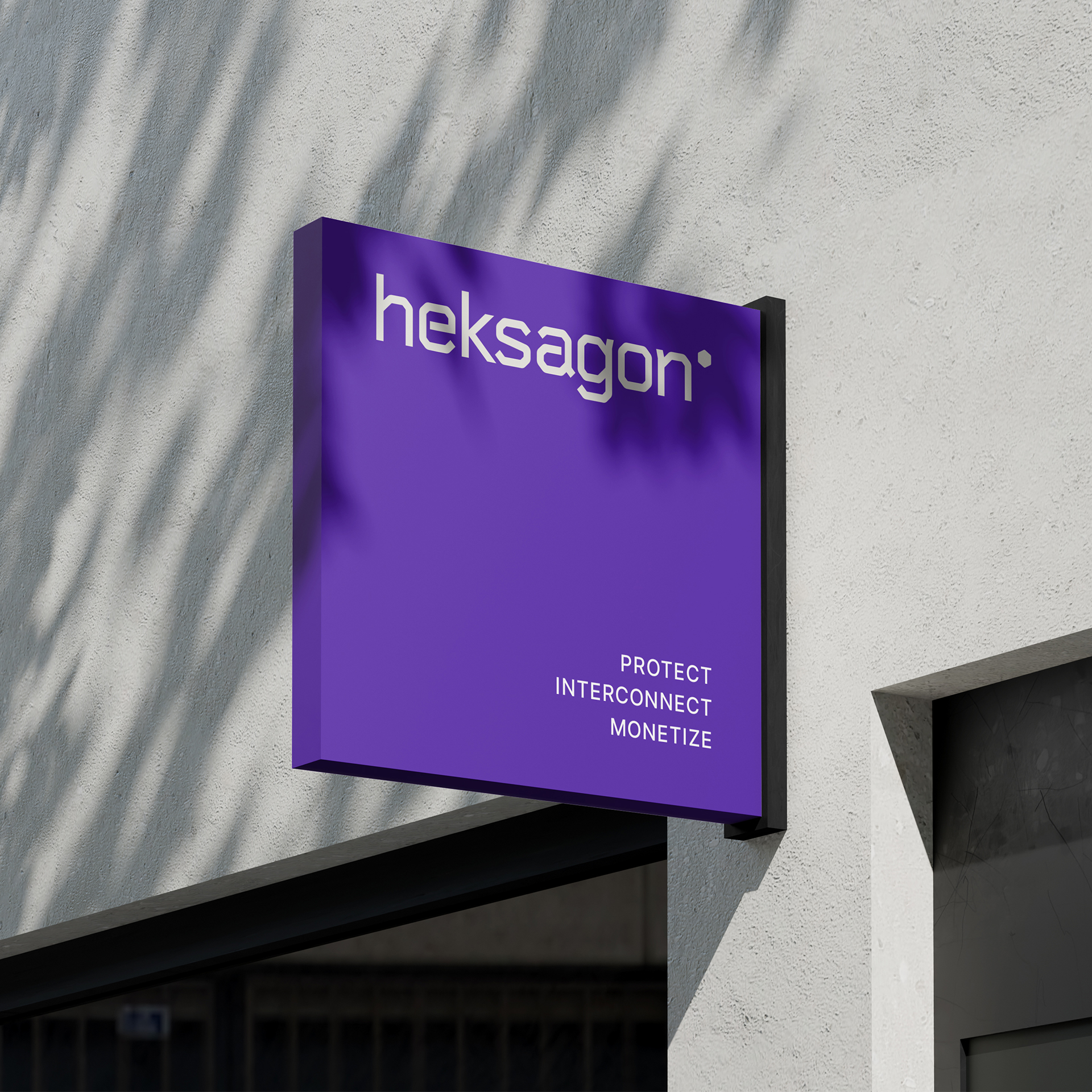
In its refreshed identity, Heksagon stands out as a modern, visually strong, and technologically advanced brand. The geometric shape, expressed in various iterations, is no longer merely a motif naturally associated with the name, but has become the company’s distinctive and effective visual signature.
Fresh projects are on the way! Sign up for news!
Related projects
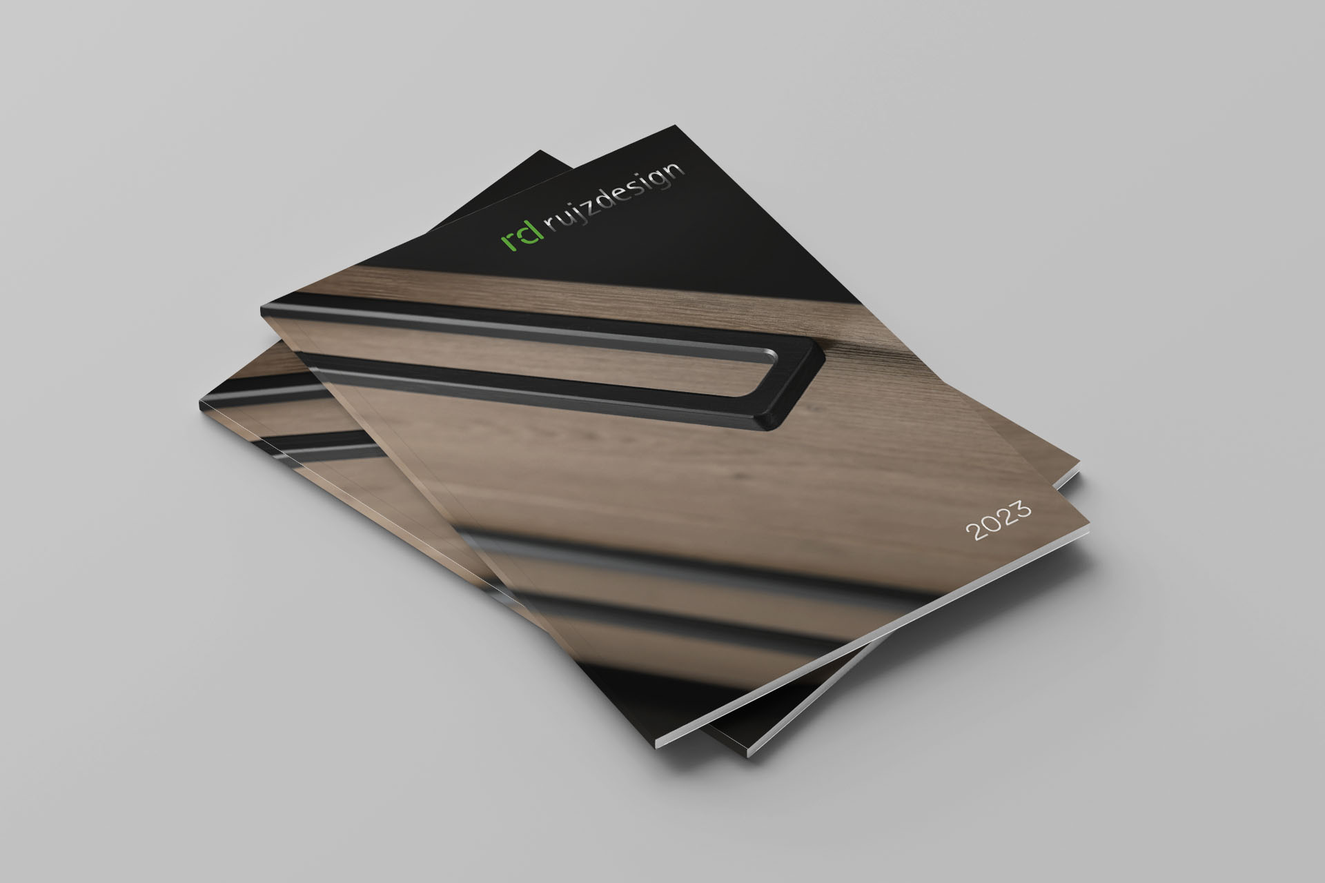
Rujz design
RUJZ - Design of a New Product Catalogue
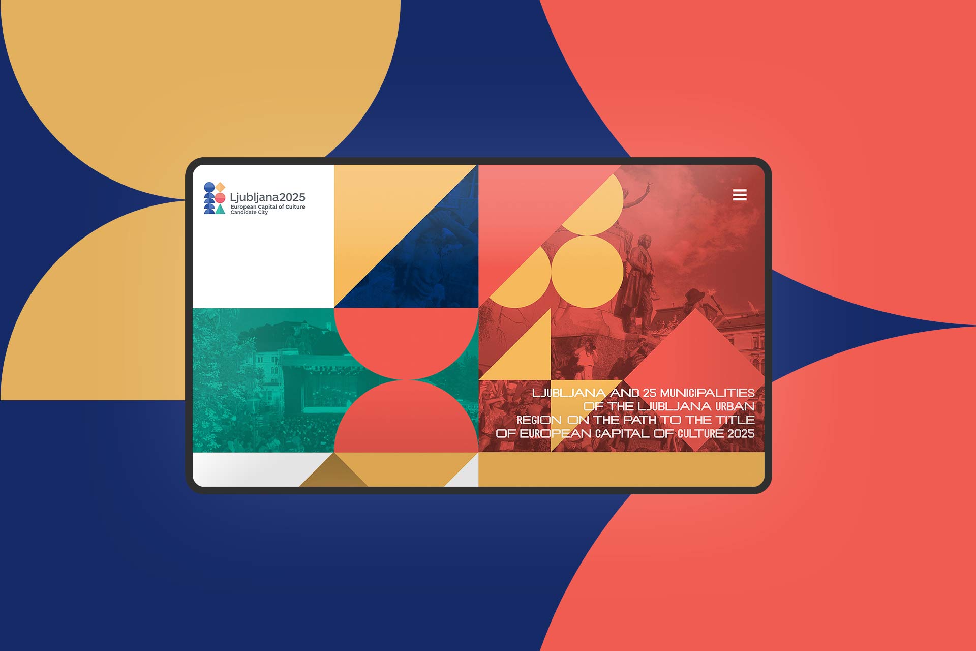
Mesta občina Ljubljana
Ljubljana – candidate country for the 2025 European Capital of Culture