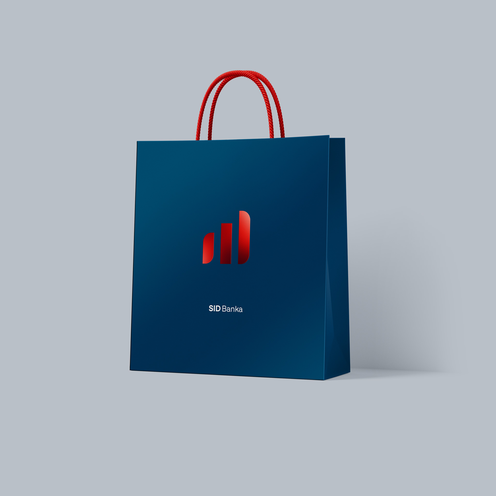
SID Bank's New Visual Identity
The redesign of SID Bank’s corporate visual identity marks an important step in the evolution of the institution’s brand, reflecting its key role in supporting the Slovenian economy, exports, and sustainable development. The refreshed identity introduces a more contemporary visual expression that keeps pace with the times and reflects the bank’s strategic direction, while preserving a strong sense of stability, trust, and responsibility.
Client
SID - Slovenska izvozna in razvojna banka, d.d.
Services
Communication campaign
Categories
B2B
Website
A Partner in the Growth of the Slovenian Economy
SID Bank is Slovenia’s national promotional, development, and export bank, providing financial and insurance services to companies and the public sector. It was established in 1992 with the aim of insuring and financing the exports of Slovenian companies. The decision to renew the Bank’s visual identity is based on the understanding that a national development and export bank must also support its unique role within the Slovenian financial system with a clear, unified, and modern image. This identity must follow contemporary design trends while maintaining the solid foundations on which the Bank was built.
A clear and understandable communication system
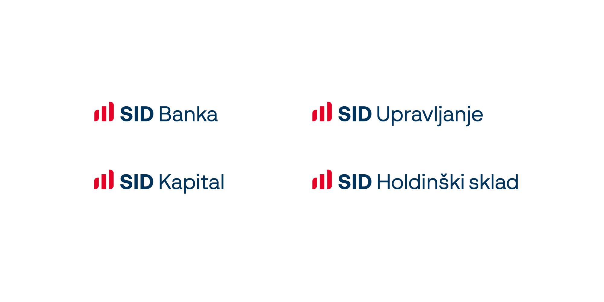
The client’s objective with the redesign of the corporate visual identity of all members of the SID Group was to establish a unified visual system that preserves the existing structure while placing it within a simple and understandable framework. This framework ensures a stronger brand positioning across communication materials, greater visibility and space for future growth. Based on an analysis of the Bank’s existing communication system and its products and services, we developed a new corporate visual identity and established a platform that sets the conditions for long-term and successful brand communication.
“The redesign of the logo is part of SID Bank’s broader strategic direction, which is based on strengthening trust, transparency, and long-term stability. As a national development bank, we address market gaps and enable financing in areas where the commercial financial market does not provide adequate conditions.”
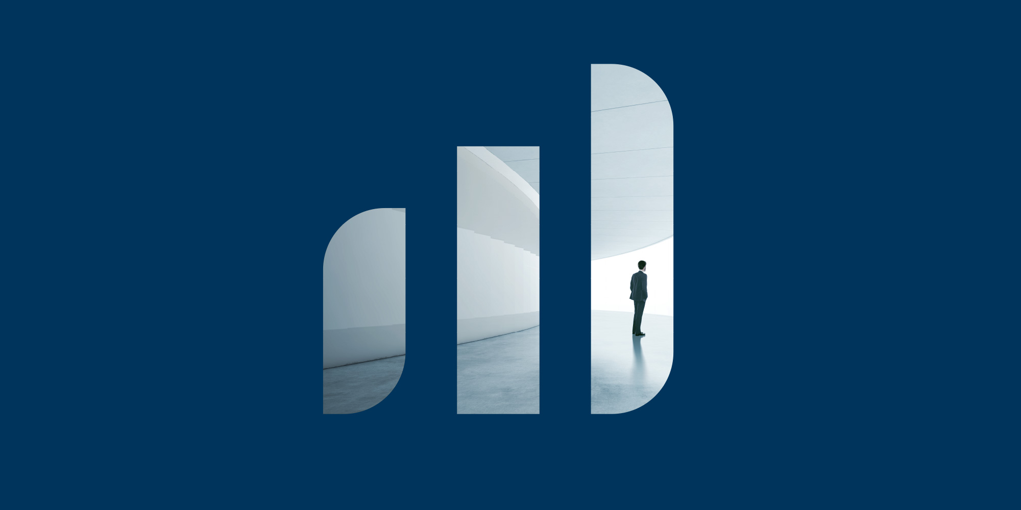
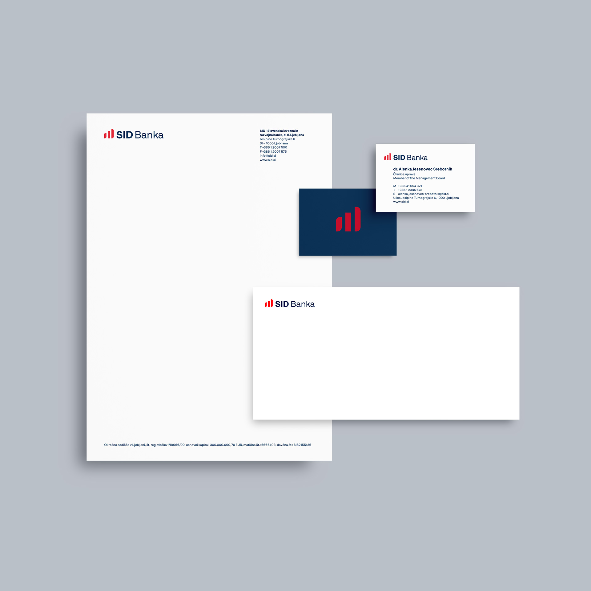
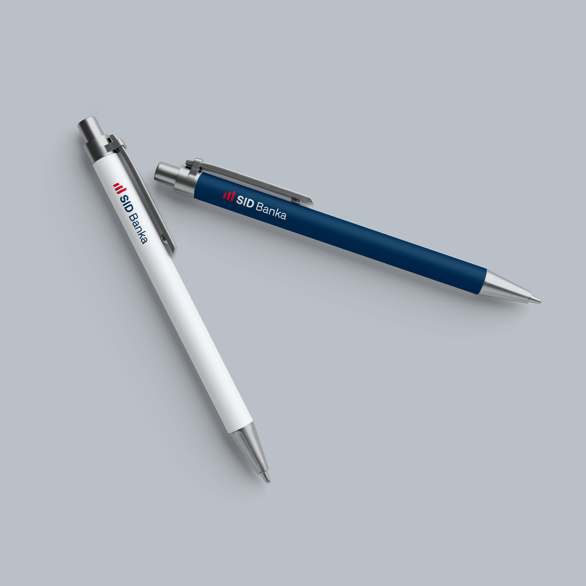
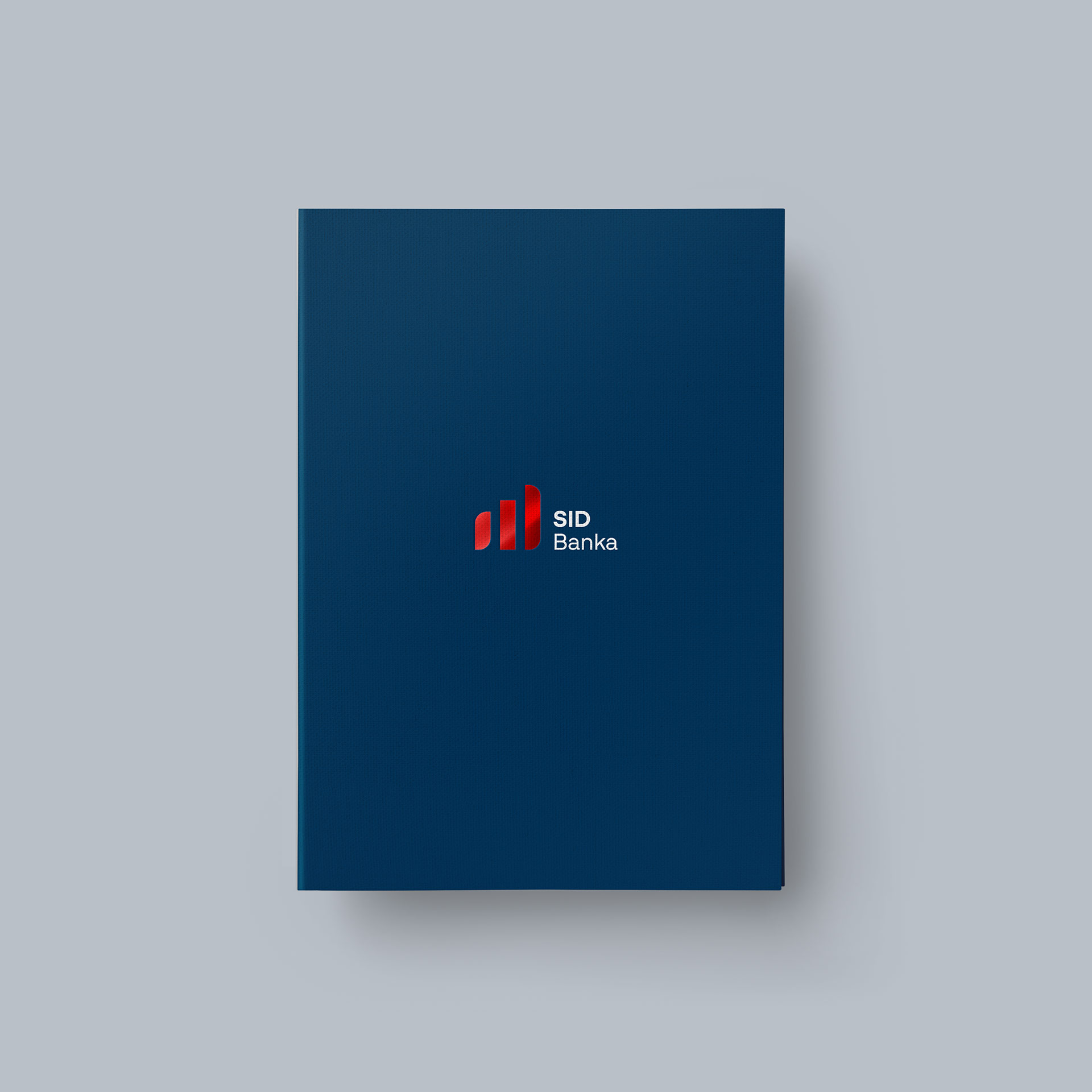
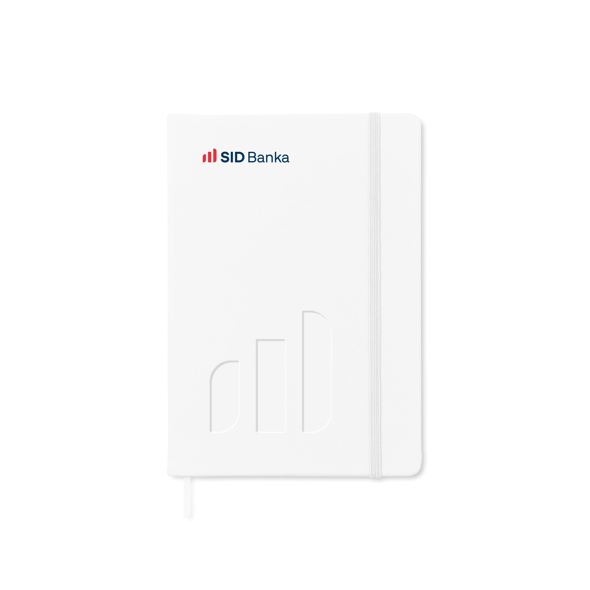
The logo as the anchor of the renewed identity
Key client’s requirements in designing the new SID Bank logo were that it clearly reflects stability, expertise, and a long-term commitment to the development of the Slovenian economy. The design is based on the red color and the “SID” wordmark, which gains a new, more subtle form through a stylized columnar representation of growth. It is complemented by a blue or white “SID Bank” wordmark, as well as the names of other group members. The color palette remains anchored in two primary colors, which have been refined and given more character. Their usage has been defined more consistently, with the addition of white and lighter shades of blue.
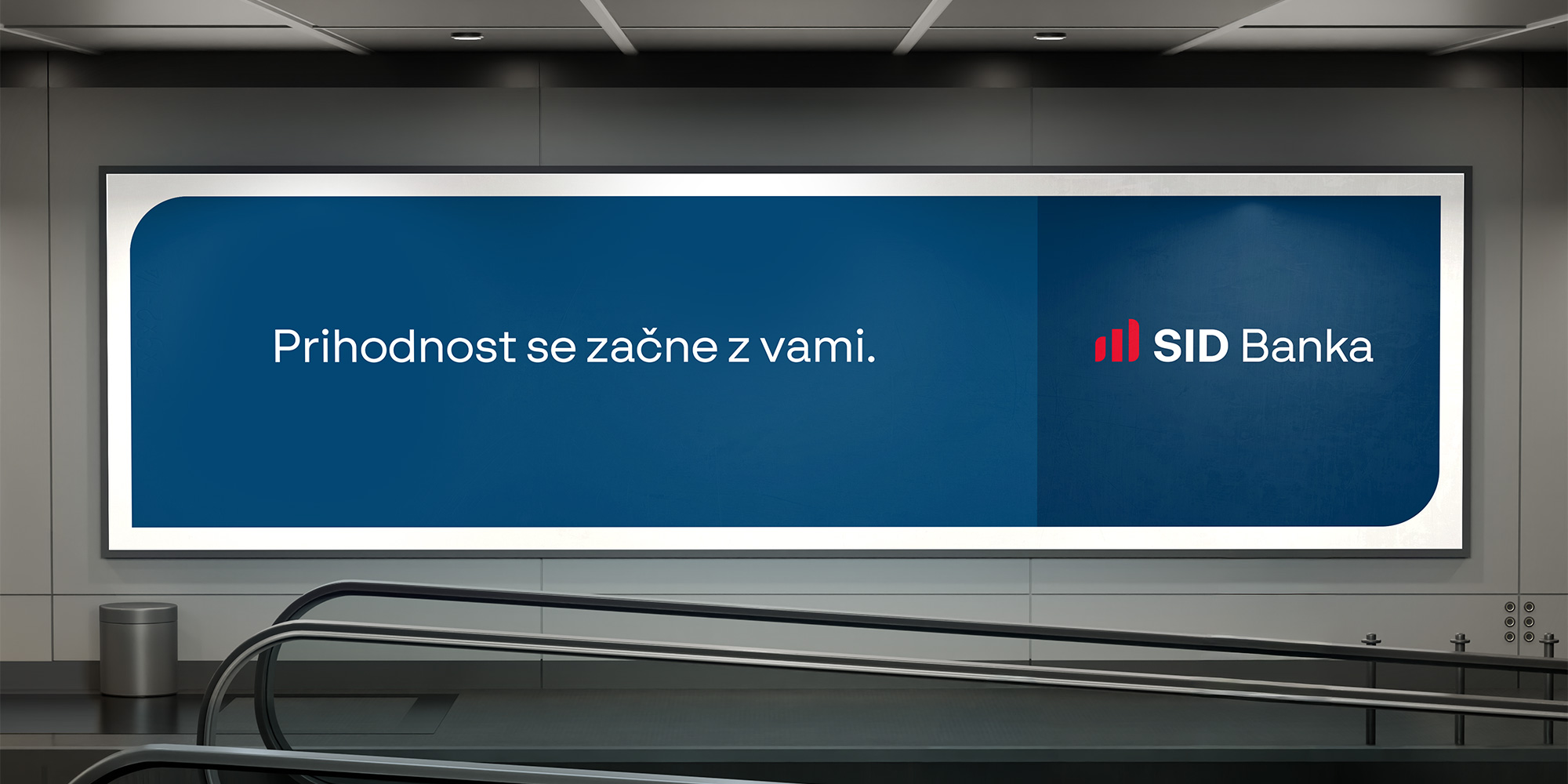
The future begins with you.
The new visual identity is based on a clearer and more contemporary visual language, unified typography, and a considered use of colour. In addition to the new logo, we have also developed a positioning slogan, “The future begins with you,” which addresses and motivates clients while expressing trust in Slovenian entrepreneurs. Combined with the refreshed visual identity, this positions SID Bank in the market as a modern and forward-looking financial institution that not only follows its partners, but also global trends in communication.
The project represents an example of a successful upgrade of a public finance institution’s identity, where the redesign reflects a thoughtful evolution towards greater modernity, clarity, and relevance.
Fresh projects are on the way! Sign up for news!
Related projects
Pravna fakulteta v Ljubljani
Faculty of Law in Ljubljana
Corwin SI d.o.o.
Kvartet – a new neighborhood in the city